UAH version 6 may not be so bad after all

November 8, 2015

In my previous post, I questioned the reliability of UAH’s revision of its dataset for its most recent version of the Lower Tropospheric Temperature anomaly. I never did hear back from Roy about the issues that I raised that made me think the new adjustments were resulting in a flawed product that was in fact inferior for accurate trend assessment over the long term to the previous version of the dataset. But a recent assessment I have done suggests to me I was perhaps too hasty in concluding UAH was now biased for trend assessment, at least over the long term. Specifically, I revisited an earlier analysis I did.

Previously, I argued that UAH data over the continental US agreed well with NOAA’s USHCN data, especially when adjusting for the higher variance of the surface relative to the atmosphere (whereas the opposite is true globally. Recalling from the discussion around Klotzbach et al. this anti-amplification is actually about what is theoretically expected for a mid latitude land area) and that this implied that, if one believed the adjustments in the USHCN data, UAH should also be pretty accurate-either that, or the agreement was a rather unlikely coincidence. The US has one of the densest observing networks in the world, and, it would not be unreasonable to suppose, probably more accurate data than many other countries. But when I repeated my analysis, this time using UAH version 6 (currently in its third beta iteration) I find that there is still essentially no trend difference over the US after variance adjustment. USHCN warms around .027 K per decade relative to variance adjusted UAH v6 and if I perform the exact same procedure to estimate the variance adjustment with v5.6 it warms just .015 K per decade relative to that data. So UAH v6 has comparably good agreement with the USHCN record as v5.6 did, suggesting there is little reason to think UAH v6 should have a long term trend bias. I still have my misgivings about the behavior of v6 over the shorter term, where it appears to have some spurious discontinuities and drifts, but the analysis I’ve just done has convinced me that these effects probably mostly cancel out over the long term. There is not then that much reason to prefer UAH v5.6 to v6.

Has UAH’s new method made v6.0 inferior?

May 3, 2015

I’m afraid the answer appears to be yes. Specifically the method appears to actually move UAH in the direction of RSS’s two major “problems.”

We previously discussed how RSS appears to have a serious drift problem associated with NOAA-12, and the period during which UAH uses AQUA as the “backbone” of it’s analysis, during which RSS arguably developed a cooling bias. UAH’s new method, currently in beta, is described here. I was enthusiastic about the possibility that UAH had in fact significantly improved upon their old methods in some way, but I was skeptical as well. I decided to do two things: first, to see whether I could still detect RSS’s discrepancies from UAH, with the causes I’d previously identified, and second, to examine more closely the differences between UAH v5.6 and the new v6.0. The first test, comparing v6.0 RSS, turned up something surprising: during the period from September of 1991 to April of 1995 (with UAH and RSS re-anomalized to their 1979-2014 means) UAH now warms relative to RSS-albeit very slowly. This was a major red flag, as it indicated that UAH probably now had a worse spurious drift problem during the NOAA-12 transition than RSS. Taking the differences between v6.0 and v5.6 confirmed that the new version warms relative to the old version during the NOAA-12 transition period we previously discussed. A drift of about .02 K per annum for about 44 months amounts to a jump of about .085 K. Previously attempting to use surface temperature data in this limited interval to adjudicate the dispute between UAH and RSS over this period suggested UAH had been correct and RSS wrong-such an analysis performed now would probably lead to the conclusion that RSS and UAH both have a severe warming bias in this particular interval. Worse still, during the AQUA interval, during which v5.6 should have been stabilized compared to RSS, v6.0 now has no trend difference at all! In other words, if-as I believed-UAH’s use of AQUA as the primary satellite during that interval (whereas RSS simply treated it as just another satellite after applying their drift corrections to them) then the drift of RSS cool during that period should have strongly indicated that RSS was flawed. But UAH now agrees with RSS over that interval, because over the AMSU period UAH v6.0 now has a significant cooling drift, too.

For the moment I’m going to be sticking with v5.6 unless Roy or John can reasonably convince me that v6.0 actually is an improvement. I’m going to leave a comment on Roy’s blog so hopefully they can address my concerns.

Be Cautious Using Price Indices

March 24, 2014

I’d just like to say that I’ve thought about something I probably should have dealt with in my previous post.

Namely, the fact that the “real” value of expenditures during the years of World War II is complete bullshit. Why? Because the deflator is totally wrong in those years.

Understand: like any index used to measure inflation, the GDP deflator is essentially a measure of prices. And like all measures of prices, it can only really be said to reflect the real purchasing power of money if prices actually reflect the effects of supply and demand-that is, the market is allowed to find the price which will clear it. However, during World War II, prices were heavily regulated and controlled. As such, while there is an underlying inflation going on in the prices that would clear the markets for various goods, the actual prices are not allowed to go any higher, and inflation manifests as chronic shortages and rationing, rather than higher prices. As soon as the price controls are lifted, there will appear to be a sudden burst of inflation-appear-but in reality this is merely the inflation that had already occurred, finally materializing.

Incidentally, Milton Friedman has compared the policy of fighting inflation by controlling prices to fighting a fever by breaking the thermometer. I thinking this doesn’t quite go far enough. It’s akin to fighting a fever by breaking the thermometer and ingesting the contents.

At any rate, I’m making some effort to correct for this, by trying to create a “price control corrected” index. You can clearly see what I’m talking about in the Consumer Price Index published by the Bureau of Labor Statistics. In late April of 1942, the General Maximum Price Regulation restricted most prices from rising above their highest levels in March of that year. Prices continued to be controlled throughout the War, and for a bit afterwards Truman and the Republicans fought over whether or not to end them, with the Republicans eventually prevailing, thanks in no small part to the courageous and heroic efforts of Senator Robert Taft of Ohio. In October of 1946 Truman was forced to do away with meat price controls to end a shortage, because by September polls indicated the public had turned against the controls, and not long after the Democrats suffered a massive electoral defeat in the mid term elections-by which I mean four days-in November, Truman abolished all price controls except on rental housing, sugar, and rice-but even before that, the conflict over the issue resulted in a brief lifting of controls in June of 1946, as a result of Truman vetoing a bill which would have continued the controls for only 9 more months-the re-imposition of controls in July was much less extensive than it had been during the War. not surprisingly, this shows up in the Consumer Price Index.

pricecontrolledcpi

The period in red is from April of 1942 to June of 1946. You can see that as soon as price controls ended, the price index shot up. But there was no sudden burst of new money, no sudden shift in the supply or demand for money. Prices rose to clear markets that had previously be restricted from doing so by Government fiat. So correcting for the actual gradual, rather than sudden decrease in the purchasing power of consumer dollars, one needs to “back date” the inflation into the period of price controls. My first attempt at doing so looks like this:

correctedcpi

The “corrected” CPI has been adjusted to increase gradually over the period April 1942 to October 1946-which allows for an adjustment period for the prices and also for the gradual, or punctuated nature of the end of controls. I can then use this corrected price index to “correct” other indices, like the GDP deflator, by assuming the same ratio between a corrected index and the corrected CPI as the uncorrected index and uncorrected CPI. An important point here is that a sudden apparent increase in prices can cause estimated “real” income to fall, or rise less than it really did-conversely, an apparent stagnation of prices can cause estimate “real” income to rise, even if it is actually flat.

The effects can be significant. For example, between 1942 and 1945, I would have previously estimated that the “real value” of total private expenditures fell about 17%-back dating the inflation hidden by price controls, the actual drop is more like 24%. Additionally, the boom in the private economy after the war is more dramatic as well, which is a given since it recovered from deeper depths during the war than I thought-A rise of 66% from 1945 to 1948 as opposed to 51%.

Anyway, food for thought.

Climate Cycle, Meet Business Cycle-Preliminaries

March 3, 2014

I’ve been wanting to write something up for a while about my thoughts on the idea of “cyclical” climate variations, and in particular to express extreme skepticism about them, but one element in particular. Many, with some degree of enthusiasm, have noted that there is a claimed “cycle” in economic activity with (very roughly) the same periodicity claimed to exist in climate: The Kondratiev Wave.

I’ll be perfectly frank. I don’t think the Kondratiev Wave exists. I don’t think it is an actual, real thing. I think it is complete and total bull crap.

But before I can write up a long ass post explaining why it is complete and total bull crap, I want to just post up some fun things.

As before, I will use US GDP data, with the portion representing Government spending removed, to represent actual meaningful production. Except this time, I really want more data than just back to 1890, so I use simple method to estimate the state and local spending from the federal spending: from 1890-2013, there is a correlation between a change in federal spending as a fraction of GDP and a change in federal spending as a fraction of total spending-the correlation is better in later years, so one should be a little bit weary of extending it back in time. But let’s proceed with reckless abandon nonetheless. The main purpose is to properly restrict what are mostly war spikes to increases in federal spending. I can use this relationship to estimate how much of the total government spending before 1890 was made up of federal spending and how much state and local spending. One can then use the estimated fraction, federal/totgov, with the actual federal spending, to get an estimate of total government spending in years before 1890. Anyway, this is what that fraction looks like, with the estimated portion highlighted:

fedtototalpercent

Note that with this, I can extend the total government as a percent of GDP back to 1792. However, the GDP data go back to 1790. After converting from percent of GDP to billions of dollars-and deflating the series to constant 2013 dollars-I observe that the first couple of years saw a slight declining trend. I simply assume 1791 was about 2.2% higher than 1792, and the same for 1790 relative to 1791, to extend the data backwards. This is less than satisfactory, but I wanted to be able to have a reasonable estimate for every year. Anyway, I then subtract those values for total government spending from GDP. For those of you who haven’t taken an undergraduate macro course: well, first of all, don’t, if you are at almost any University in the US. Second, GDP is defined as the sum of all final expenditures by: Consumers (C) Government (G) Investors (I) and the difference between Exports and Imports (“Net Exports”) (NX). So we are basically talking about GDP – G, or C + I + Nx. As measures go, this has a few things to recommend it over GDP including G. But it depends what you are trying to “measure.” And it still suffers from a number of defects. Nevertheless, as a measure of economic growth and fluctuation, I find it nigh infinitely superior.

Anyway, frequently, economists refer to fluctuations in GDP as representing an “output gap”-this basically refers to the percent departure of the GDP from a long term trend curve. There are lots of ways to calculate a long term trend curve, and how you do so determines a great deal about what you will conclude about cyclical variations in output. It’s also questionable whether the entire thing is a very meaningful concept, or more specifically, what meaning to attach to the long term trend curve. My current think is somewhere between that it is meaningless data torture, and that it represents just a proxy for progress. Again, let’s proceed with reckless abandon regardless.

My method for removing the long term trend line has as a goal not removing anything that might conceivably represent a short term variation. So I want a highly aggressive filter. Oh say, I’ve got that. Specifically, I take the following steps: I take the growth rate year over year, for each year relative to the previous. I then lag that back one year. For all years but the first and last, I average those two series. For the first and last, I take the average of the next two, and previous two years, respectively. Then, I iteratively smooth it: I take three point centered averages, with the first and last points double weighted to extend the centered averages to the end of the series, 1110 times-that is 10*(years-2)/2 (since years happens to be 224, an even number). I then use this final smoothed series of “long term growth rates” to create a compound growth curve starting at 1 in 1789. I multiply this by a factor suggested by regression against GDP-G. I then take the ratio GDP-G/TREND1, This seemed to consistently under estimate values in the first half of the data. So I did the smoothing on that ratio 1110 times, and multiplied TREND1 by that factor, which was the new estimate of the long term trend. Then I take the ratio of the actual GDP-G to the trend curve, to estimate the “output gap”:

OutputGap

Some things stand out: One, we are currently about 9% under trend. That is pretty bad, although not exceptionally bad. Another thing that stands out is the Great Depression. Actually, it’s probably the first thing that jumps out at you. What you might not recognize, is what is going on in the 1940’s, when it spikes below trend again? That’s what I like to call the “War Depression.” War Depressions are actually common feature in much of the data-notably associated with the War of 1812, the Civil War, World War 1, and World War 2 (after that, wars no longer stand out as times of exceptional government displacement of economic activity, which becomes the peace time norm). In the case of the War Depression of the 1940’s, it’s a Depression you’ve never heard of. That’s because people didn’t lose their jobs. In fact, employment grew, because the Government drafted people into the military and made exceptions for war time production jobs, and so on. But private investment was way down-this wasn’t growth, this wasn’t a consumer economy, this was a Soviet style Command economy. Instead of people choosing between scarce means to their own ends, the Government choose between means to it’s ends. In that sense, and in the sense that people live an austere life under rationing and price controls, this was truly a depressed economy. You might call it the opposite of a jobless recovery. A jobful depression. As Hayek says in the Keynes v. Hayek rap, round two,  “Creating employment is a straightforward craft, when the nation’s at war, and there’s a draft. If every worker was staffed in the army and fleet, we’d have full employment-and nothing to eat.” And let’s be clear about that: the intervention of the Government caused those conditions. No ifs, ands, or buts. In 1942, GDP-G was at trend-or at least, only slightly below, to the point of statistical indistinguishability. And it took a considerable growth rate to get there, since this is coming out of the Depression. The ramp up in War spending-mostly after 1942-didn’t end a Depression that was already over. It created a new one that it hid in the standard statistics. But when the spending on the war ended, when the Government lifted a lot of war time price controls, rationing, and other things that-as I said before-made it a Soviet Style Command Economy-massive cuts in Government spending were associated with expansion of investment-and that’s an important point, this wasn’t “pent up consumer demand” that merely offset decreased Government spending-this was a booming recovery of investment, less than it was consumption. And why not? Frankly, the situation both during the Depression and the War was, from the perspective of the investor, terrifying as hell. This is documented fact. And when you combine the War Depression and the Great Depression together, they make the single longest slump of non Government output below trend in US history, at 18 years from 1930-1947. Contrast that with the over trend boom periods from 1879-1893 (15 years) and 1895-1913 (19 years). I note the latter two periods for a couple of reasons: first, conventional wisdom is that an over trend economy must reflect an “inflationary gap”-with demand generally outpacing supply driving up the price level. But during the first period, the deflator decreased almost 9%-the average inflation rate was about -0.6%. The second period, despite being well over trend for a long time, was just ~1.8%-from 1879 to 1913, the price level increased only about 23.5%. Compare to 1979-2013, which saw an increase of 261.3%. And that was emphatically not a period where every year but one was above trend! Second, that period, 1879-1913, popped out of the analysis. I did not go fishing for it. But it happens to correspond to the period associated with the classical gold standard. Like, pretty much exactly. So that seems to me a pretty strong indication that, at least back then, a gold standard worked quite well, in the sense that it allowed strong, persistent economic development, even above and beyond the long term growth rate, with long term stable prices. I think there are a lot of questions about how good it would be to reinstate it now-especially unilaterally. Notably, the performance under the Gold Exchange Standard was not very good at all, or Bretton Woods for that matter-however, a strong case can be made that the major shift in monetary policy in 1913-internationally, in the demise of the classical gold standard, and in the United States, the creation of the Federal Reserve system-was a shift to an inferior system, and certainly the alleged goals of the creation of the Fed were not actually achieved. Notably, the claim in Econlib’s Gold Standard article that the economy under the Fed, at least after WWII (the interwar years generally being handwaved as “practice” before Central Bankers allegedly became wise and enlightened) is dated. More up to date, mainstream analyses (not my analysis either, people like Christina Romer-not exactly a Right winger) the volatility of the pre-Fed era has generally been over estimated. The same is true for what it says of unemployment. Note that a much less powerful attenuation filter is used to assess volatility relative to trend than I do. Though I do find that the entire Fed period has a greater standard deviation of the “output gap” than the 100 prior years, it appears that the data I use and the method for removing the trend does show “improvement” in decreased volatility if you compare 1946-2013 with the 68 years before the Fed. On the other hand, the standard deviations for 1879-1913 and 1979-2013 are nearly identical-the latter period is only very slightly lower. Factoring in the possibility that my method is leaving in things that really shouldn’t count as “volatility,” the possibility that the Measuring Worth data suffers from defects that cause it to intrinsically over estimate past volatility (which may or may not be the case) because of their methodology, and the possibility that recent economy has been “luckier” in terms of avoiding supply shocks, and there really is not much evidence here that the Fed stabilized output relative to the Gold Standard-although it does appear to have depressed output relative to the Gold Standard. Well, to be fair, that could be because of the larger government, and not the monetary policy. Similarly, as that paper I linked points out, the larger Government “theoretically” should reduced volatility, as well as reducing growth-acting essentially as a poor man’s good monetary policy. I’m not sure I buy that, since there isn’t much reduced volatility to attribute in the first place.

Hm, I’m rambling quite a bit. Why was I writing this again? Oh, right, I just wanted to describe the data I’d be using for my post on the (non) existence of the Kondratiev Wave. Anyway, we’ll revisit that later. For now, there are several interesting things for readers to ponder.

Also this was a great opportunity for me to ramble on about economics on what is ostensibly a science blog. 😉

It’s Beginning to Look a Lot Like El Niño

February 17, 2014

I’ve noticed it’s been awfully wet for the dry season lately here in my part of Florida. Really wet. I found this kind of interesting: there are some people saying they expect an El Niño this year or next. Now, there is some association of El Niño here in this part of Florida with wet conditions, but even so, if El Niño is the “cause” of the increase in precipitation, why is precipitation increasing as if in anticipation of El Niño? This looks like a job for phase matching!

This time, to save time, I just used the raw SOI, took the average of 11 and 13 month centered averages, and identified the start of all periods where that index was negative (El Niño) or positive (La Niña) for at least 12 continuous months. The first such incident since 1895-when the US climate division data, and NCDC’s US data in general, began-was 33 months after January 1895, which gives us a long run up to the events in our composites. I average the events aligned by start month. I do the same with the monthly precipitation values for Florida Climate Division 6, but…that basically gave me weirdly aliased seasonal cycles. So I did it with percentage departure from the long term (1895-2013) mean for each month, and I also did it with the average of 11 month and 13 month centered totals. Now, SOI is inversely correlated with ENSO as defined by temperatures, and ENSO warm events are supposed to be associated with more precipitation and cold events with less (at least here, anyway), so SOI will be expected to be inversely related to precipitation. Additionally, the data are on very different scales. So, just for purposes of easier visual comparison and a better sense of lead/lag, I use linear regression of the time evolution of average ENSO events to predict the percent departure from long term mean, and the average of 11 and 13 month running totals. Again, this is just to put the ENSO events on the right scales for comparison-as a linear transformation of the time evolution of the event, it does not alter the basic shape. For La Niña events, things ended up looking like this:

LaNinaPrecipFlorida6

The green is the actual precipitation, the blue is the evolution predicted by the SOI event at zero lag. On the left is the average of 11 and 13 month centered totals, on the right percent departure from the mean. The SOI does appear to very slightly precede the precipitation, more so as the event starts to end than when it starts to begin. La Niña does indeed appear to either cause, or be at least correlated with some cause, of reduced precipitation in Florida Climate Division 6. But when I did the same thing with El Niño, the result was a little different in an interesting way:

ElNinoPrecipFlorida6

The green is the actual precipitation, the red is the evolution predicted by the SOI event at zero lag. On the left is the average of 11 and 13 month centered totals, on the right percent departure from the mean. Now this is different! Precipitation does, indeed, start to increase before the direction of SOI changes toward an El Niño! But it doesn’t start to decrease again until after the El Niño peaks. This means that the direction of causation here is actually ambiguous, if one even exists, but it also means that increasing precipitation in my part of Florida can be an indicator ahead of time that an El Niño is coming! And for that reason, I am predicting we will see an El Niño, and with it there will be more rain (here, anyway).

Grumpy 2.0’s Last Hurrah

February 14, 2014

I’m still working on my improved EBM, but I figure, since Grumpy 2.0 is so easy to implement as a simple multiple regression model, that I can do a fun little exercise that is bound to get me in trouble.

First of all, the nature of the problem: attempting to assess sensitivity and attribution from unknown forcing acting on the temperature record. Recall that in our model, the temperature (or rather the anomaly) should be equal to the forcing times the sensitivity, minus the derivative of temperature times the response time. Problem: the forcing is unknown. Solution: represent it in the simplest terms possible. F = K + U or forcing is equal to the “known” forcing, plus the “unknown” forcing. we can represent the unknown forcing as simply as possible by making it straight line. Since many people assume the unknown forcing must be negative (hiding away the warming), we’ll pick a line with negative slope. We’ll call that u, and have our regression model give it a coefficient b-which will be the sensitivity times the magnitude of the forcing-so that b*u = a*U where a is the sensitivity. The model will get to pick what value of b gives the best fit to the data. On the other hand, the coefficient on K will just be the sensitivity, a, and K itself we will take to be the sum of all greenhouse gas forcings, and the volcanic forcings. We stress that this strives to explain the data in the simplest terms possible. The final predictor variable is the derivative of T, which represents the response time. We take that to be the average the first differences and the first differences shifted back a year, with the first month’s and last month’s values being averaged with zero. We fit to monthly HadCRUT4.

So what does the model say? Well, it picks a sensitivity equivalent to about .5 K per doubling of CO2, it picks a negative coefficient for the unknown term, indicating it prefers a solution where something else contributes to the warming trend, not that something hides it, and a time constant of much less than a month, indicating the model prefers to fit the data using negligible thermal inertia. All but the last of these I personally find plausible. The low response time is probably a consequence of the fact that there is almost no relationship between T and dT/dt at such a short timescale (it is overwhelmed by noise in the data). On the other hand, there is little basis to assume either strong aerosol forcing or that natural variability made a negligible contribution to the observed trend, given that the (admittedly simplistic) model works best if the opposite is true in both cases.

Anyway, if I’ve managed to get myself into a sufficient amount of trouble with all that, I guess you understand why I am trying to create a more sophisticated and defensible model.

Current Project Preview-“Grumpy 3.0”

February 13, 2014

Many years ago I developed a simple EBM-well, actually that would be an great exaggeration of what I actually did, which was really just use a very simple functional form more or less equivalent to what I’ve been using. At any rate, I called it “Grumpy” a sort of self mocking reference to my own generally curmudgeonly persona, and also a reference to Lucia’s similar model exercise, “Lumpy” so named because it is a “lumped parameter model.” Anyway, unfortunately the work, which was kind of amateurish but meant to be a sort of sensitivity test for conclusions about model fits to the observed data, has been lost to the sands of internet time-by which I mean, Climate Audit’s forum is defunct.

At any rate, much of the work I’ve been doing since then has been with what I suppose one might call “Grumpy 2.0” which really doesn’t feature any improvements over the old version, but has been intended for uses in curve fitting exercises.

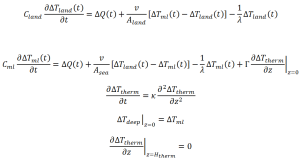
But for a bit now, I’ve been working on something. It’s not ready for prime time yet, but it’s a lot more sophisticated than my previous modeling exercises, and offers the potential for improving on the previous results significantly. Unfortunately it has many more unknowns, and I could spend an eternity searching the parameter space. At any rate, for those of you who want to see something more sophisticated than “one box” I give you Grumpy 3.0, a three box energy balance model:

Grumpy3point0

Like I said, I’m not ready for prime time with this just yet. I’ve got a lot more work to do. But it’s kind of a cool project.

Now, it would be totally pointless for me to just tell you “what I’m working on” with nothing more than that. So I guess I’m also wondering if there is anyone out there interested in helping with some heavy lifting math ways and statistics ways that I’m…just a tiny bit out of my depth on? One of my current goals is to use this in conjunction with my work on volcanic eruptions to determine what combinations of parameters can be interpreted to be consistent with the data on volcanic response. But like I said, the parameter space is huge, if only because there are so many. Which might help people understand why I often say it’s a fairly trivial matter to claim anything is consistent with your preconceived notions about sensitivity. All one needs is to toy around with various parameter values. And people need to understand how many of these parameters-which are mathematical simplifications of real processes that one needs to represent reality accurately-are almost completely unconstrained, or constrained very poorly. For example, the eddy diffusion coefficient kappa, is not known to within better than an order of magnitude. As far as I can tell, the land-sea coupling constant v is even more poorly constrained. And in most cases, the function ΔQ, the radiative forcing, is largely unknown. And of course, lambda-the sensitivity-is not even claimed to be known to within better than ±50%, meanwhile the reality of the situation is probably worse than that. But at least there are ways one might constrain it’s value independently of those other uncertainties. I’ve looked into a number of such approaches, virtually all of which have given answers very close to one another and all lower than even the lowest “accepted” edge of the mainstream values. I gets someone frustrating at times. I don’t really want to be a climate extremist, being a political extremist is hard enough work. Being a lukewarmer would be a lot easier. Or at least I like to think so. I mean, I could fit in with all the cool people and not have to justify myself to literally everyone, only most people. Because I seem to occupy, If I do say so myself, the unpleasant position in the debate of being that guy who has no friends because he’s a critic of everybody. Well, okay, I’m not the only guy in that position.

But here’s my guess. Of the people who do analytical work on climate blogs I respect, I’d guess their best estimate of what the sensitivity is, is at least 3 to 4 times where I’d currently put it. So there’s a bit of a tension there that large goes unnoticed. And the part I dislike the most about this is that I think the gap is getting wider. When I first got really engaged in this debate-what has it been, like, 5 years now or something?-I would have only just barely failed to qualify as a lukewarmer. If I’m critical of the fact that mainstream sensitivity estimates are literally the same now, without even an improvement of uncertainty, as they were in the late 1970’s-and I am-I have to also be critical of myself and others-those I consider to be good analysts and largely unbiased-for failing to converge, and even diverge in our opinions. And since I’m the one whose opinion has changed, it’s concerning to consider the possibility that I am the problem.

Wow, I really kinda drifted on that one. Anyway, if you’re still reading after all that, and would like to contribute to “team Grumpy” I’ll be pleased to hear from you.

Vaporization

January 28, 2014

Okay. So the surface of the Earth undergoes evaporative cooling at a current rate of 86.4 W/m^2. According to Wentz et al.precipitation globally increased at a rate of ~1.4% per decade from 1987-2006. Evaporation = Precipitation-water balance condition. Implies a trend of 1.2096 W/m^2 additional evaporative cooling per decade. Simultaneous trend in the average of GISS (1200 km), HADCRUT4, and NCDC v3.2.0 was about .2 K per decade. Simple algebra, evaporative cooling per degree of warming: 6.048 W/m^2 K. Necessary temperature change for evaporative cooling to cancel decrease in radiative cooling by 3.7 W/m^2: ~.61 K.

Sanity check! Models increase evaporation at a rate of 1-3% per K. This translates to between 0.864 W/m^2 K and 2.592 W/m^2 K, assuming Earth-like baseline latent heat flux, which compensates 3.7 W/m^2 decrease in radiative cooling between ~4.4 to ~1.43 K. Models typically range in sensitivity between 1.5 to 4.5 K for a doubling of carbon dioxide. Okay, numbers check out-maybe slight underestimate? Ice albedo feedback?

Folding in other findings for maximum climate extremism:

Detrend average surface temperature index and UAH LT (over the same period) annual average anomalies. Quick regression, suggests amplification of short term fluctuations of 1.44 LT relative to surface. Divide LT anomalies by this factor. Trend over 1987-2006 is ~.12 K per decade. Simple algebra again: increase in evaporative cooling per degree of warming: 9.793 W/m^2 K. Sensitivity implied: ~.38 K per doubling.

Wow okay that’s pretty small. I can push it a little closer if I assume a smaller LT amplification factor (which is probably biased by GISS’s reduced interannual variability?)

Note this is a calculation of the feedback. If you want to get those numbers higher to the sensitivity you like, you can’t wave your arms around blathering like an idiot about “transient climate response.” Instead you need to wave your arms around blathering like marginally less of an idiot about “non linear feedback” or “time dependent feedback.” The current result indicates that there is a very high slope tangent to the curve of outgoing radiation as a function of temperature. Higher sensitivity requires this slope to drop off pretty rapidly. Just simple physics would suggest a baseline increase in the rate at 4σT^3-4σT0^3. You need some positive feedback that is relatively weak now but very strong at just a slightly higher temperature. Or I don’t know maybe you can appeal to ice sheet melting and carbon cycle feedbacks and we can agree that climate change could be a problem, you know, in a few hundred years. Certainly not this century.

Well, good luck with that.

Using Phase matching to identify the ENSO signal

January 21, 2014

Using a technique I have previously established, and used to isolate various signals in temperature data, I thought it would be interesting to identify the ENSO signal in global temperature data-using the “Invariant ENSO Index” described here. While I don’t think it generally wise to consider ENSO something to be “removed” from the temperature data (since ENSO is itself a part of the climate system and thus part of climate response) it is nevertheless interesting to examine the issue. because ENSO is clearly a major aspect of weather and climate variations, and it provides an additional opportunity to show how the technique I am using can identify signals in the temperature data that are not easily separated out otherwise. I identified events as any 12 month or longer excursion of the average of 13 and 11 month centered averages of the IEI (multiplied by -1 and divided by 10) above or below zero (continuously). That is, if the annually smoothed index changed sign for even a single month, month of the switch back was considered a new event for compositing. In compositing the time evolution of ENSO events, I used the unsmoothed and inverted and standardized index. This is what those look like:

IEIcompositeeventprofileRed is the composite evolution of El Niño events, green the composite evolution of La Niña events. Note that, the La Niña event of 2010 is not included as an event in the composite (except as a follow on of the previous event) because too few months have passed since then, the La Niña composite would be much shorter than the El Niño composite otherwise, instead of being of comparable length. Then I aligned the HadCRUT4 data similarly (with the low frequency signal removed as previously established in my post on volcanic signals in the data) The averages there look like this:

ENSOResponseProfilesAs one can clearly see, a typical El Niño event is indeed followed by an increase (red) in global average near surface air temperatures, and a typical La Niña by a decrease (blue). By smoothing both the temperature response profiles and the ENSO event profiles, and removing some trends in the first 28 and 24 months (when the smoothed profiles switch which is greater than the other) and rescaling the smoothed profiles, I identify the peak values of events and responses. Peak event values occur 12 to 11 months in (for El Niño and La Niña respectively) and peak responses occur 14 months into an event. I can then take those smoothed, early trend corrected, rescaled profiles’ values for their peak event magnitudes and responses, and use those to estimate the linear effect:

ENSOregressionEncouragingly, the the responses to La Niña and El Niño seem to scale the same (that is, a straight line as opposed to one with an obvious bend indicating asymmetric response). Using the slope of the regression, and lagging one two or three months, I can then “remove” the ENSO signal thus detected from the global data. Here is what that looks like, annually smoothed:

HADCRUT4ENSOsignalremovedIt is evident that this did not remove the all the effects of every individual ENSO event-some may have a large impact than others-but it did, I think, remove the “average” ENSO response. The above graph has a number of interesting features-for example the effect of the large El Niño in the mid 1940’s was to in effect turn two isolated temperature spikes into a persistent “hump” in the temperature data.

A New Normalized Short Term Index for ENSO

January 17, 2014

I previously tried to create an index for ENSO which would have a stable long term mean and variance. Now, using the Southern Oscillation Index, I have modified the approach somewhat:

First of all, one 0f my concerns was shifting seasonality in the data, so when I did my smoothing process (described here) I repeated it ten times on each month as a timeseries separately. This did indeed suggest there were changes in the seasonal structure of the SOI. These were then rescaled by a factor of approximately 1.4, as suggested by a simultaneous linear regression. I then renormalized each month to a mean (1876-2013) of zero and standard deviation of 10 (that is, I divided by their standard deviations and multiplied them by 10). I then took that data, took the absolute value of each data point, and repeated by smoothing procedure 10 times on that, which gave me a sort of index of the variations in the variance, over the long term. I took that, divided it by it’s average value so it would scale to a mean of 1, and then divided my normalized timeseries by that variance factor. For comparison purposes I also renormalized the original SOI data to a long term mean and standard deviation of 10. Here is what they look like in comparison to one another:

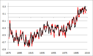
IEIvsSOIRed is the original SOI, black the IEI. The main difference appears to be that the variance of ENSO in the middle of the record is increased, and near the beginning and end it is reduced. Specifically, there seems to have been reduced ENSO variance from the 1920’s to the 1970’s, a period of relative ENSO quiescence. However the greatest variance was, originally, at the beginning of the record, indicating that ENSO variance has tended to decrease. But the purpose of isolating the trends of these kinds and removing them is to judge ENSO events themselves, as to how “abnormal” they are relative to typical background climate. This is the “background” we are removing:

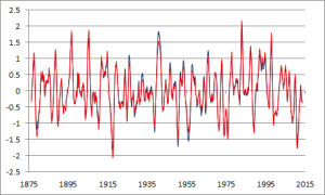
SOIminusIEIThere isn’t really much of a trend in this data (or in the SOI data to begin with) and it is not at all obvious how these changes in the SOI “background” might relate to global warming or anything else. They appear, instead, to simply be slow variations in the ENSO phenomenon that have heretofore gone unrecognized. For easier visualization and connection with ENSO events, I also divided the indices by 10, multiplied by negative one, and took the average of 11 and 13 month centered averages:

IEIvsSOIinvertedstandardizedsmoothedThe El Niño circa 1940 is much more prominent, now, being in fact larger than the El Niño of 1997, but not 1982.

Similarly I can take that index (ie divided by 10 and multiplied by -1), but instead of annually smoothing, I can take calendar year averages, and then rank the years from most negative, to most positive. The 20 strongest La Niña years, in order from strongest to weakest:

1917
1950
2011
1975
1956
1955
1971
1910
2008
1879
1938
2010
1974
1988
1999
2000
1973
1964
1886
1989

The same for El Niño years:

1905
1940
1941
1896
1982
1987
1888
1994
1997
1965
1919
1977
1953
1992
1946
1877
1993
1991
1912
1983

It should be interesting to examine various data for evidence of weather differences in such years. Because they are distributed the way they are, they should be essentially orthogonal to any long term trends.